


Hello, fellow Reactêrs!! Welcome to the third article in our series on React. If you haven't read the first article on props and the second article on useState, we recommend doing so since this article builds on the concepts covered in those articles. In this article, we're going to build a simple slider using React useState and props. The assets and design for this project are gotten from John Smilga's React 18 course but the code is written by me.
Introduction
What is a slider and why is it essential in web development
A slider can also be referred to as a slideshow or carousel. It usually displays different contents in an interactive manner like when a user clicks on a button or after a specified timeframe.
The main purpose of a slider is to make the aesthetic of the website look more pleasing and grab the attention of the users. They offer a visually engaging way to convey messages, showcase products, or tell a story without overwhelming the user with too much content at once.
Sliders can grab users' attention, encourage exploration, and increase user engagement on a website. They can also help to optimize limited screen space by providing a compact and organized way to display multiple pieces of content.
Setting Up the Project
Installing React and creating a new project
We're going to use Vite + React for this project. You can read this article and find out why I didn't use create-react-app. So first of all, you need to install and launch an IDE, I prefer VSCode but you can use any IDE of your choice.
The next thing to do is to install the most recent version of Vite, along with the React template. Then name the folder you are going to work with. I named mine "Slider" but you can give it any name of your choice. During the installation process, there might be a slight delay as the required dependencies are downloaded. However, Vite's installation speed is faster compared to using create-react-app. Once the installation is complete and the folder has been created, you can navigate to the folder so we can begin working on our project.
Setting up the necessary dependencies and folder structure
To simplify the development process, we'll be using the Tailwind CSS framework. Tailwind provides ready-to-use components and utilities that can be easily customized. You can find detailed installation and setup instructions in the official Tailwind documentation.
In addition, we'll need to use icons in our project which can be gotten from FontAwesome. To install FontAwesome, you can follow the straightforward instructions provided in this StackOverflow thread.
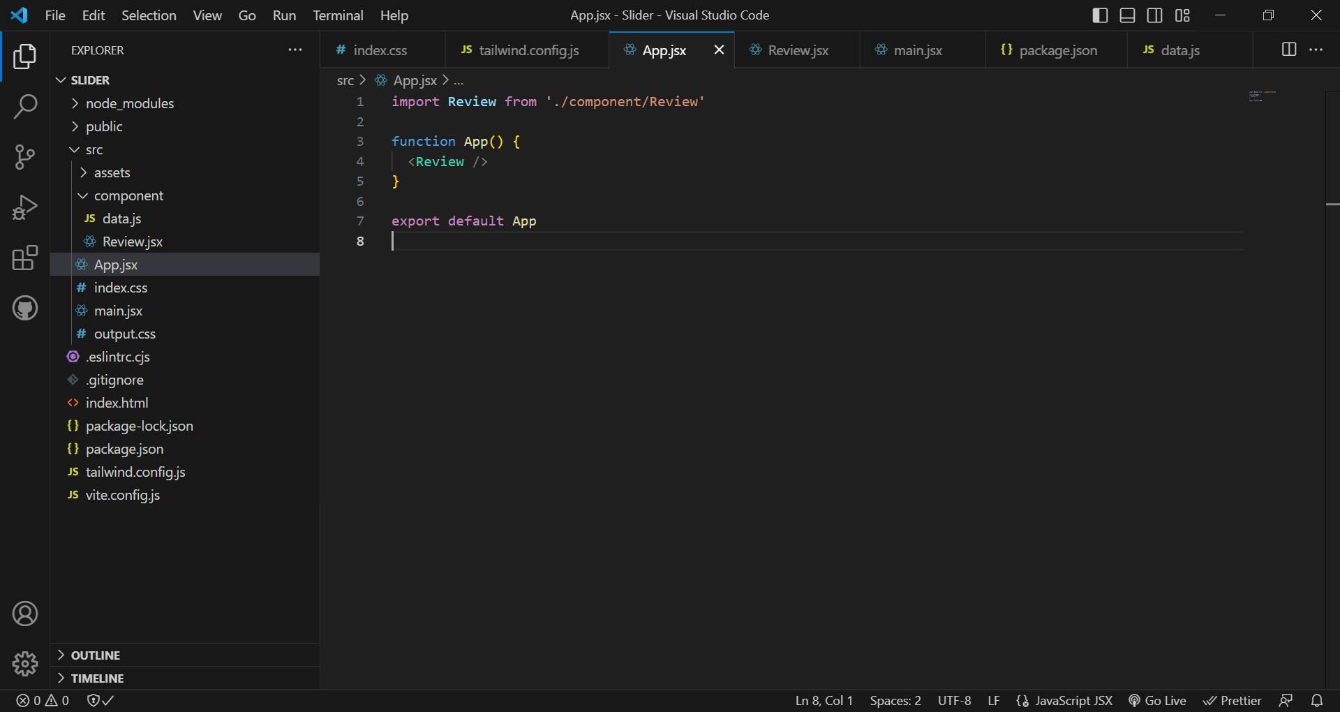
This is the resulting folder structure below:

For the Tailwind configuration, we're using the auto-generated index.css as our input CSS. Then we add the colors that would be needed for the project inside our tailwind config file.

/** @type {import('tailwindcss').Config} */
export default {
  content: ["./src/**/*.{js,jsx,ts,tsx,html}",],
  theme: {
    extend: {
      colors: {
        'grey-500': '#f8fafc',
        'grey-600': '#475569',
        'primary-100': '#e2e0ff',
        'primary-200': '#c1beff',
        'primary-300': '#a29dff',
        'primary-400': '#837dff',
        'primary-500': '#645cff',
        'primary-600': '#504acc',
        'primary-700': '#3c3799',
        'primary-800': '#282566',
        'primary-900': '#141233',
      },
    },
  },
  plugins: [],
}
Then we link the output.css file inside of the main.jsx below.

Then we create a Review.jsx component file inside the components folder which is then imported into the App.jsx file. All our codes are going to be written inside the Review.jsx file.
For the customer review data that would be used, create a data.js file inside the components folder and paste the below data inside it.
const reviews = [
  {
    id: 1,
    name: 'susan smith',
    job: 'web developer',
    image:
      'https://res.cloudinary.com/diqqf3eq2/image/upload/v1586883334/person-1_rfzshl.jpg',
    text: "I'm baby meggings twee health goth +1. Bicycle rights tumeric chartreuse before they sold out chambray pop-up. Shaman humblebrag pickled coloring book salvia hoodie, cold-pressed four dollar toast everyday carry",
  },
  {
    id: 2,
    name: 'anna johnson',
    job: 'web designer',
    image:
      'https://res.cloudinary.com/diqqf3eq2/image/upload/v1586883409/person-2_np9x5l.jpg',
    text: 'Helvetica artisan kinfolk thundercats lumbersexual blue bottle. Disrupt glossier gastropub deep v vice franzen hell of brooklyn twee enamel pin fashion axe.photo booth jean shorts artisan narwhal.',
  },
  {
    id: 3,
    name: 'peter jones',
    job: 'intern',
    image:
      'https://res.cloudinary.com/diqqf3eq2/image/upload/v1586883417/person-3_ipa0mj.jpg',
    text: 'Sriracha literally flexitarian irony, vape marfa unicorn. Glossier tattooed 8-bit, fixie waistcoat offal activated charcoal slow-carb marfa hell of pabst raclette post-ironic jianbing swag.',
  },
  {
    id: 4,
    name: 'bill anderson',
    job: 'the boss',
    image:
      'https://res.cloudinary.com/diqqf3eq2/image/upload/v1586883423/person-4_t9nxjt.jpg',
    text: 'Edison bulb put a bird on it humblebrag, marfa pok pok heirloom fashion axe cray stumptown venmo actually seitan. VHS farm-to-table schlitz, edison bulb pop-up 3 wolf moon tote bag street art shabby chic. ',
  },
];

export default reviews;
Creating the Slider Component
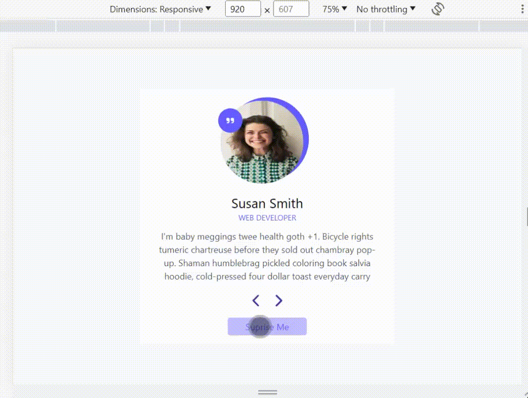
The live website for the slider can be found here while the Github link is here. This is the design and how it's going to look.

Building the UI
First of all, we're going to create the visual appearance of the website without worrying about its functionality just yet. This involves building various components such as card, and buttons for moving to the next or previous item and displaying images.
To ensure that our design matches the intended layout, we will extract the details from the first item in our data array. These details will then be used to populate the card component with the necessary content. By completing this step, we establish the foundation of our user interface, allowing us to proceed with implementing the remaining elements and functionalities.
After accessing the first item, we'll store the state using useState and pass it as a props to the Card component.
import { useState } from "react"

import { FontAwesomeIcon } from "@fortawesome/react-fontawesome";
import { faChevronLeft, faChevronRight, faQuoteRight } from "@fortawesome/free-solid-svg-icons";

import reviews from "./data";

const Review = () => {

  const [customerReview, setCustomerReview] = useState(reviews[0]);

  return (
    <section className="flex justify-center items-center min-h-screen bg-grey-500">
        <Card {...customerReview} />
    </section>
  )
}

const Card = ({name, job, image, text}) => {
  return (
    <div className="review-card w-2/4 max-md:w-3/4 min-h-[28rem] bg-white text-center px-6">
      <div className="customer-img bg-primary-500 w-[150px] h-[150px] max-sm:w-[100px] max-sm:h-[100px] rounded-full m-auto mt-4 relative">
        <img src={image} alt={name} className="w-[150px] h-[150px] max-sm:w-[100px] max-sm:h-[100px] rounded-full absolute right-2.5 top-1.5" />
        <div className="h-11 w-11 max-sm:w-8 max-sm:h-8 max-sm:top-3 top-5 left-[-14px] bg-primary-500 rounded-full flex justify-center items-center absolute z-10 ">
        <FontAwesomeIcon icon={faQuoteRight} className="text-white" />
        </div>
      </div>
      <h4 className="mt-6 text-2xl">{name}</h4>
      <p className="text-sm text-primary-500 font-normal mb-3">{job.toUpperCase()}</p>
      <p className="text-grey-600">{text}</p>
      <div className="flex justify-center items-center mt-4">
        <button className="text-2xl text-primary-700"><FontAwesomeIcon icon={faChevronLeft} /></button>
        <button className="text-2xl text-primary-700 ms-6"><FontAwesomeIcon icon={faChevronRight} /></button>
      </div>
      <button className="px-8 py-1 text-primary-500 bg-primary-200 my-4 rounded">Suprise Me</button>
    </div>
  )
}

export default Review
In the provided code snippet above, we begin by importing an array of objects called reviews from our data source. The purpose of this array is to store various customer reviews. We then utilize the useState hook to save the first item from the reviews array into a state variable named customerReview.
By using the useState hook, we can dynamically manage the state of this variable, allowing us to update it if needed. Storing the customer review in a state variable enables us to conveniently display the relevant content on a card component.
Next, we pass the customerReview state variable as a prop to the Card component. This prop contains the necessary data for the Card component to render the specific customer review on the card.
By structuring the code in this manner, we can ensure that the first review from the reviews array is displayed on the Card component. This approach offers flexibility in handling the customer reviews, as the useState hook allows for easy updates to the displayed review.
Inside of the Card component we destructure the props to extract the specific values we need for rendering the review.

Adding functionalities
Capitalize the first character of the customer's name
The first thing I'd like us to add is to make the first letter of the customer's name to be in uppercase. And to do that, I would prefer to use Regex. I'm sure there are other methods to do this but Regex is faster and easier.
import { useState } from "react"

import { FontAwesomeIcon } from "@fortawesome/react-fontawesome";
import { faChevronLeft, faChevronRight, faQuoteRight } from "@fortawesome/free-solid-svg-icons";

import reviews from "./data";

const Review = () => {

  const [customerReview, setCustomerReview] = useState(reviews[0]);

  const capitalizeWords = (str) => {
    return str.replace(/(^|\s)\S/g, function (match) {
      return match.toUpperCase();
    });
  }

  return (
    <section className="flex justify-center items-center min-h-screen bg-grey-500">
        <Card {...customerReview} capitalizeWords={capitalizeWords} />
    </section>
  )
}

const Card = ({name, job, image, text, capitalizeWords}) => {
  return (
    <div className="review-card w-2/4 max-md:w-3/4 min-h-[28rem] bg-white text-center px-6">
      <div className="customer-img bg-primary-500 w-[150px] h-[150px] max-sm:w-[100px] max-sm:h-[100px] rounded-full m-auto mt-4 relative">
        <img src={image} alt={name} className="w-[150px] h-[150px] max-sm:w-[100px] max-sm:h-[100px] rounded-full absolute right-2.5 top-1.5" />
        <div className="h-11 w-11 max-sm:w-8 max-sm:h-8 max-sm:top-3 top-5 left-[-14px] bg-primary-500 rounded-full flex justify-center items-center absolute z-10 ">
        <FontAwesomeIcon icon={faQuoteRight} className="text-white" />
        </div>
      </div>
      <h4 className="mt-6 text-2xl">{capitalizeWords(name)}</h4>
      <p className="text-sm text-primary-500 font-normal mb-3">{job.toUpperCase()}</p>
      <p className="text-grey-600">{text}</p>
      <div className="flex justify-center items-center mt-4">
        <button className="text-2xl text-primary-700"><FontAwesomeIcon icon={faChevronLeft} /></button>
        <button className="text-2xl text-primary-700 ms-6"><FontAwesomeIcon icon={faChevronRight} /></button>
      </div>
      <button className="px-8 py-1 text-primary-500 bg-primary-200 my-4 rounded">Suprise Me</button>
    </div>
  )
}

export default Review
We create a function called capitalizeWords that takes a string as an argument. It uses the replace method with a regular expression pattern to find all non-whitespace characters in a string and convert them to uppercase. The pattern matches either the start of the string or a whitespace character, followed by a non-whitespace character. After it finds a match, the callback function converts it to upperCase. We then pass this function as a prop to the Card component and call it inside the textContent of the paragraph where the customer name is declared.

The next review button
In order to be able to implement the next button functionality, we'll also need to make use of React hook usestate because every time the button is clicked, the state would need to be updated and the DOM re-rendered.
import { useState } from "react"

import { FontAwesomeIcon } from "@fortawesome/react-fontawesome";
import { faChevronLeft, faChevronRight, faQuoteRight } from "@fortawesome/free-solid-svg-icons";

import reviews from "./data";

const Review = () => {
  let [count, setCount] = useState(0);
  const [customerReview, setCustomerReview] = useState(reviews[count]);

  const capitalizeWords = (str) => {
    return str.replace(/(^|\s)\S/g, function (match) {
      return match.toUpperCase();
    });
  }

  const nextReview = () => {
    count ++;

    if (count > reviews.length - 1) {
      count =  0;
    }

    setCount(count);
    setCustomerReview(reviews[count]);
  }

  return (
    <section className="flex justify-center items-center min-h-screen bg-grey-500">
        <Card {...customerReview} capitalizeWords={capitalizeWords} nextReview={nextReview} />
    </section>
  )
}

const Card = ({name, job, image, text, capitalizeWords, nextReview}) => {
  return (
    <div className="review-card w-2/4 max-md:w-3/4 min-h-[28rem] bg-white text-center px-6">
      <div className="customer-img bg-primary-500 w-[150px] h-[150px] max-sm:w-[100px] max-sm:h-[100px] rounded-full m-auto mt-4 relative">
        <img src={image} alt={name} className="w-[150px] h-[150px] max-sm:w-[100px] max-sm:h-[100px] rounded-full absolute right-2.5 top-1.5" />
        <div className="h-11 w-11 max-sm:w-8 max-sm:h-8 max-sm:top-3 top-5 left-[-14px] bg-primary-500 rounded-full flex justify-center items-center absolute z-10 ">
        <FontAwesomeIcon icon={faQuoteRight} className="text-white" />
        </div>
      </div>
      <h4 className="mt-6 text-2xl">{capitalizeWords(name)}</h4>
      <p className="text-sm text-primary-500 font-normal mb-3">{job.toUpperCase()}</p>
      <p className="text-grey-600">{text}</p>
      <div className="flex justify-center items-center mt-4">
        <button className="text-2xl text-primary-700"><FontAwesomeIcon icon={faChevronLeft} /></button>
        <button className="text-2xl text-primary-700 ms-6"><FontAwesomeIcon icon={faChevronRight} onClick={() => nextReview()} /></button>
      </div>
      <button className="px-8 py-1 text-primary-500 bg-primary-200 my-4 rounded">Suprise Me</button>
    </div>
  )
}

export default Review
In the code you provided, we begin by creating a state variable called count using the useState hook. Its initial value is set to 0 because we want to increment the count whenever a button is clicked. Previously, we displayed the first item from the reviews data by setting the initial value of the customerReview state variable to reviews[0]. However, now we can directly replace it with the count variable. This way, whenever the value of count changes, the state value for customerReview will also change accordingly.
We then create a function called nextReview, which will be attached to the next button and called when the button is clicked. Inside the nextReview function, we increment the value of the count variable by 1.
Next, we use an if statement to check if the value of count is greater than the length of the reviews array minus 1. We do this to handle the scenario where the user keeps clicking the next button and the count value exceeds the number of items in our reviews data. Since the length of an array starts counting from 1, while array indices start from 0, we need to subtract 1 from the length of the array. If the condition is true, we reset the value of count back to 0.
After that, we update the count state by passing in the updated count value to the setCount state function. Similarly, we update the customerReview state by setting it to reviews[count] using the setCustomerReview state function.
By implementing this code, we can cycle through the reviews by clicking the next button, and when we reach the end of the reviews, it will loop back to the beginning. The count state variable keeps track of the current index, and the customerReview state variable updates accordingly to display the corresponding review.

The previous review button
The code for the previous review button is almost the same as the one for the next review button except that instead of incrementing count, we decrement it by 1. And the conditional changes too, this time, we'll check for if the count is lesser than 0, we rest the value of count to 3.
import { useState } from "react"

import { FontAwesomeIcon } from "@fortawesome/react-fontawesome";
import { faChevronLeft, faChevronRight, faQuoteRight } from "@fortawesome/free-solid-svg-icons";

import reviews from "./data";

const Review = () => {
  let [count, setCount] = useState(0);
  const [customerReview, setCustomerReview] = useState(reviews[count]);

  const capitalizeWords = (str) => {
    return str.replace(/(^|\s)\S/g, function (match) {
      return match.toUpperCase();
    });
  }

  const nextReview = () => {
    count ++;

    if (count > reviews.length - 1) {
      count =  0;
    }

    setCount(count);
    setCustomerReview(reviews[count]);
  }

  const prevReview = () => {
    count --;

    if (count < 0) {
      count =  3;
    }

    setCount(count);
    setCustomerReview(reviews[count]);
  }

  return (
    <section className="flex justify-center items-center min-h-screen bg-grey-500">
        <Card {...customerReview} capitalizeWords={capitalizeWords} nextReview={nextReview} prevReview={prevReview} />
    </section>
  )
}

const Card = ({name, job, image, text, capitalizeWords, nextReview, prevReview}) => {
  return (
    <div className="review-card w-2/4 max-md:w-3/4 min-h-[28rem] bg-white text-center px-6">
      <div className="customer-img bg-primary-500 w-[150px] h-[150px] max-sm:w-[100px] max-sm:h-[100px] rounded-full m-auto mt-4 relative">
        <img src={image} alt={name} className="w-[150px] h-[150px] max-sm:w-[100px] max-sm:h-[100px] rounded-full absolute right-2.5 top-1.5" />
        <div className="h-11 w-11 max-sm:w-8 max-sm:h-8 max-sm:top-3 top-5 left-[-14px] bg-primary-500 rounded-full flex justify-center items-center absolute z-10 ">
        <FontAwesomeIcon icon={faQuoteRight} className="text-white" />
        </div>
      </div>
      <h4 className="mt-6 text-2xl">{capitalizeWords(name)}</h4>
      <p className="text-sm text-primary-500 font-normal mb-3">{job.toUpperCase()}</p>
      <p className="text-grey-600">{text}</p>
      <div className="flex justify-center items-center mt-4">
        <button className="text-2xl text-primary-700"><FontAwesomeIcon icon={faChevronLeft} onClick={() => prevReview()} /></button>
        <button className="text-2xl text-primary-700 ms-6"><FontAwesomeIcon icon={faChevronRight} onClick={() => nextReview()} /></button>
      </div>
      <button className="px-8 py-1 text-primary-500 bg-primary-200 my-4 rounded">Suprise Me</button>
    </div>
  )
}

export default Review

Surprise me button for random review
The surprise me button gives a random review when it is clicked. The code is pretty easy and uses Math.random method in javascript.
import { useState } from "react"

import { FontAwesomeIcon } from "@fortawesome/react-fontawesome";
import { faChevronLeft, faChevronRight, faQuoteRight } from "@fortawesome/free-solid-svg-icons";

import reviews from "./data";

const Review = () => {
  let [count, setCount] = useState(0);
  const [customerReview, setCustomerReview] = useState(reviews[count]);

  const capitalizeWords = (str) => {
    return str.replace(/(^|\s)\S/g, function (match) {
      return match.toUpperCase();
    });
  }

  const nextReview = () => {
    count ++;

    if (count > reviews.length - 1) {
      count =  0;
    }

    setCount(count);
    setCustomerReview(reviews[count]);
  }

  const prevReview = () => {
    count --;

    if (count < 0) {
      count =  3;
    }

    setCount(count);
    setCustomerReview(reviews[count]);
  }

  const randomReview = () => {
    const randomNumber = Math.floor(Math.random() * reviews.length);

    setCount(randomNumber);
    setCustomerReview(reviews[randomNumber]);
  }

  return (
    <section className="flex justify-center items-center min-h-screen bg-grey-500">
        <Card {...customerReview} capitalizeWords={capitalizeWords} nextReview={nextReview} prevReview={prevReview} randomReview={randomReview} />
    </section>
  )
}

const Card = ({name, job, image, text, capitalizeWords, nextReview, prevReview, randomReview}) => {
  return (
    <div className="review-card w-2/4 max-md:w-3/4 min-h-[28rem] bg-white text-center px-6">
      <div className="customer-img bg-primary-500 w-[150px] h-[150px] max-sm:w-[100px] max-sm:h-[100px] rounded-full m-auto mt-4 relative">
        <img src={image} alt={name} className="w-[150px] h-[150px] max-sm:w-[100px] max-sm:h-[100px] rounded-full absolute right-2.5 top-1.5" />
        <div className="h-11 w-11 max-sm:w-8 max-sm:h-8 max-sm:top-3 top-5 left-[-14px] bg-primary-500 rounded-full flex justify-center items-center absolute z-10 ">
        <FontAwesomeIcon icon={faQuoteRight} className="text-white" />
        </div>
      </div>
      <h4 className="mt-6 text-2xl">{capitalizeWords(name)}</h4>
      <p className="text-sm text-primary-500 font-normal mb-3">{job.toUpperCase()}</p>
      <p className="text-grey-600">{text}</p>
      <div className="flex justify-center items-center mt-4">
        <button className="text-2xl text-primary-700"><FontAwesomeIcon icon={faChevronLeft} onClick={() => prevReview()} /></button>
        <button className="text-2xl text-primary-700 ms-6"><FontAwesomeIcon icon={faChevronRight} onClick={() => nextReview()} /></button>
      </div>
      <button className="px-8 py-1 text-primary-500 bg-primary-200 my-4 rounded" onClick={randomReview}>Suprise Me</button>
    </div>
  )
}

export default Review
The code snippet above uses the Math.random() method, an inbuilt JavaScript function, to generate random decimal numbers between 0 and 0.9999. By multiplying this random decimal number by the length of the "reviews" data, which in our case is 4, we obtain random numbers between 0 and 4, excluding 4. Since the Math.random() method generates fractional numbers, we use the Math.floor() method to round down the result to the nearest whole number.
Once we have the random number, we update both the count state variable and the customerReview state variable with this value. This means that when the code executes, the count will be set to a random index from the reviews data array, and the customerReview will be updated to display the corresponding review based on the randomly generated index.
Refactoring the previous and next review button functions
If you take a look at the functions created for the next review and the previous review, you'll notice that they are pretty similar just that one increments while the other decrements. This means that we can put everything inside of one function that can be reusable in both buttons.
import { useState } from "react"

import { FontAwesomeIcon } from "@fortawesome/react-fontawesome";
import { faChevronLeft, faChevronRight, faQuoteRight } from "@fortawesome/free-solid-svg-icons";

import reviews from "./data";

const Review = () => {
  let [count, setCount] = useState(0);
  const [customerReview, setCustomerReview] = useState(reviews[count]);

  const capitalizeWords = (str) => {
    return str.replace(/(^|\s)\S/g, function (match) {
      return match.toUpperCase();
    });
  }

  const switchReview = (nextOrPrev) => {

    if (nextOrPrev === "next") {
      count ++;
    } else {
      count --;
    }

    if (count > 3) {
      count =  0;
    } else if (count < 0) {
      count = 3;
    }

    setCount(count);
    setCustomerReview(reviews[count]);
  }

  const randomReview = () => {
    const randomNumber = Math.floor(Math.random() * reviews.length);

    setCount(randomNumber);
    setCustomerReview(reviews[randomNumber]);
  }

  return (
    <section className="flex justify-center items-center min-h-screen bg-grey-500">
        <Card {...customerReview} capitalizeWords={capitalizeWords} switchReview={switchReview} randomReview={randomReview} />
    </section>
  )
}

const Card = ({name, job, image, text, capitalizeWords, switchReview, randomReview}) => {
  return (
    <div className="review-card w-2/4 max-md:w-3/4 min-h-[28rem] bg-white text-center px-6">
      <div className="customer-img bg-primary-500 w-[150px] h-[150px] max-sm:w-[100px] max-sm:h-[100px] rounded-full m-auto mt-4 relative">
        <img src={image} alt={name} className="w-[150px] h-[150px] max-sm:w-[100px] max-sm:h-[100px] rounded-full absolute right-2.5 top-1.5" />
        <div className="h-11 w-11 max-sm:w-8 max-sm:h-8 max-sm:top-3 top-5 left-[-14px] bg-primary-500 rounded-full flex justify-center items-center absolute z-10 ">
        <FontAwesomeIcon icon={faQuoteRight} className="text-white" />
        </div>
      </div>
      <h4 className="mt-6 text-2xl">{capitalizeWords(name)}</h4>
      <p className="text-sm text-primary-500 font-normal mb-3">{job.toUpperCase()}</p>
      <p className="text-grey-600">{text}</p>
      <div className="flex justify-center items-center mt-4">
        <button className="text-2xl text-primary-700"><FontAwesomeIcon icon={faChevronLeft} onClick={() => switchReview("prev")} /></button>
        <button className="text-2xl text-primary-700 ms-6"><FontAwesomeIcon icon={faChevronRight} onClick={() => switchReview("next")} /></button>
      </div>
      <button className="px-8 py-1 text-primary-500 bg-primary-200 my-4 rounded" onClick={randomReview}>Suprise Me</button>
    </div>
  )
}

export default Review
In this updated code, we replaced the previous prevReview and nextReview functions with a new function called switchReview. This function takes a parameter called nextOrPrev which represents the direction of the review switch ("prev" or "next").
Inside the switchReview function, there is a conditional statement that checks if the nextOrPrev parameter is equal to "next". If it is, then the count variable is incremented by 1. If the nextOrPrev parameter is not equal to "next", it means it is "prev", so the count variable is decremented by 1.
Following that, there is another conditional statement that checks if the value of count is greater than 3. If this condition is true, it means that the count has exceeded the maximum index of the reviews data array, so the value of count is reset to 0. Otherwise, if the condition is false, the value of count is reset to 3.
Finally, the code updates the state of both the count and customerReview variables using their respective state update functions (e.g., setCount and setCustomerReview). This ensures that the changes in the count variable and the corresponding review are reflected in the user interface.

Conclusion
In this step-by-step guide, we have provided a comprehensive approach to building a simple slider component using React. By following the outlined steps, you can create an interactive slider that allows users to navigate through a collection of items.
Throughout the guide, we explored fundamental concepts such as component structure, state management using the useState hook, props and event handling. We also leveraged React's JSX syntax to create dynamic and reusable components.
By breaking down the development process into manageable steps, we were able to implement essential functionalities like displaying the current item, handling navigation through previous and next buttons, and addressing edge cases to ensure a seamless user experience.
Moreover, we incorporated additional features like randomizing the displayed item and ensuring the slider loops back to the beginning when reaching the end of the collection.
With the knowledge gained from this guide, you can expand upon the slider component to suit your specific project requirements. This tutorial serves as a solid foundation for building more complex slider components with additional customizations and integrations.
By applying the principles covered here, you are well-equipped to enhance your React applications with interactive and engaging slider components that enrich the user experience!!!
Thank you so much for reading and I hope you enjoyed reading this article as much as I enjoyed writing it, and even more. Keep learning and building with React